


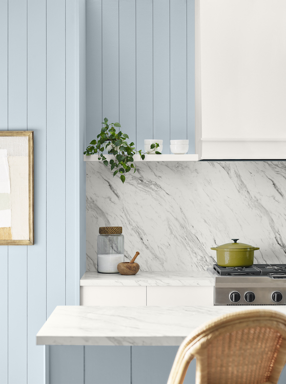
Sherwin-Williams has selected a light blue, Upward SW 6239, as its 2024 Color of the Year. The hue symbolizes relaxation and peace, two emotions that the paint brand suggests will dominate the upcoming year’s design choices.
According to Director of Color Marketing Sue Wadden, this “blissful” cool blue will create timeliness spaces and evoke emotions of harmony. The company says it’s a color that maintains its airiness in a variety of scenarios, working well in both residential and commercial settings, from Nordic aesthetics to coastal.
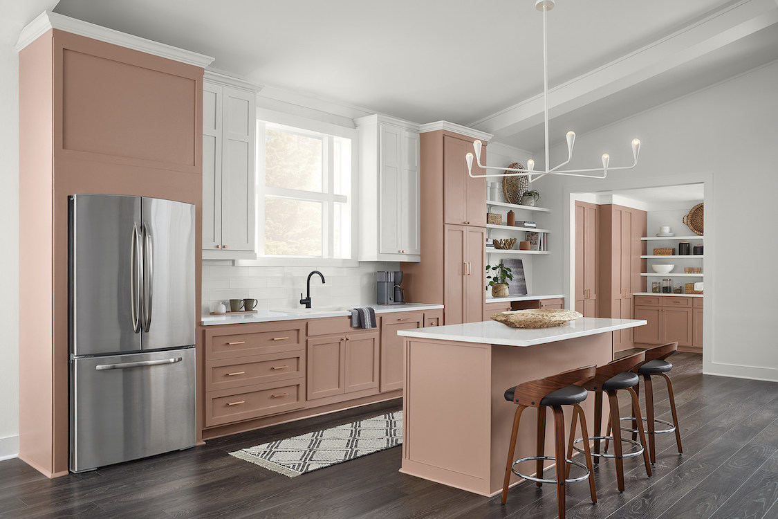
This selection comes as a contrast to Sherwin-Williams’s 2023 Color of the Year, Redend Point SW 9081, an earthy, dusty rose. Wadden credits the increase of empathy, tied with a general warmth seen generally around the world as the inspiration for last year’s shade. This year, it's all about taking a pause to breathe.
“Upward SW 6239 represents the gentle forward momentum in all of our lives,” said Wadden. “It brings to life that carefree, sunny day energy that elicits emotion of contentment and peace. With this color, we invite our consumers to take a pause and infuse a new sense of ease and possibility into their spaces—one that doesn’t overwhelm, but rather establishes meditation and tranquility.”
Sherwin-Williams now curates entire palettes of colors for the upcoming years called the Colormix Forecast, touching on various trending aspects of the home in the year to come. Each selection features a specific color family for ease of use, beginning with Palette No. 1: blues and greens; followed by reds and purples; deeps and darks; and delicate tints.
Add new comment
Related Stories

Design Trends to Watch in 2024
What’s in and out for the upcoming year? Remodeling designers share insights
 Chief Marketing Officer Amanda Valente, CEO Michael Valente, Chief Design Officer Briana Gershenzon, and Chief Construction Officer John Bura.")
Michael Valente Swims in His Own Direction
Renovation Sells found an opportunity gap in the market, and then they exploded
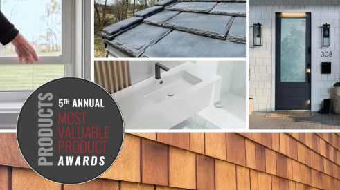
The 5th Annual Most Valuable Product Awards
These MVP Award winners beat out more than 150 submissions

Insights for Designing Outdoor Kitchens
Was the pandemic-fueled thirst for outdoor kitchen remodels and additions a fluke, or is it here to stay? Plus: The top design considerations for outdoor kitchens

Builders Focus on Remodeling as New Construction Declines
Some builders hope to benefit from remodeling's strength, giving a slight boost to new construction confidence

4 Award-Winning Remodeling Projects to Inspire
This selection of Best in American Living Award winners showcases balancing of original character with modern-day design
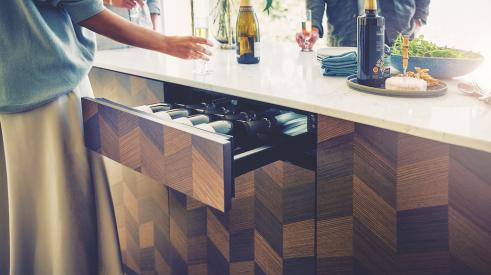
Innovative Products: A Wine Cooler in a Drawer
A new kind of wine cooler hits the market, perfect for compact spaces
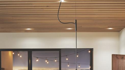
Innovative Products: A Kitchen Faucet... Hanging from the Ceiling?
Just when you thought you had seen everything a faucet could do, Purist Suspend enters
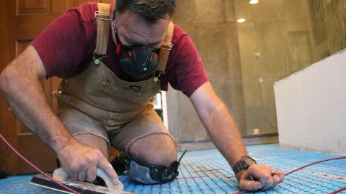
6 Tips for Electric Floor Heating Systems
These quick tips and tricks provide a base knowledge to begin your floor heating education

Detailed Design: Benefits of Biophilism
See the details our Model ReModel contractors chose to infuse nature into their ADU